WANdisco
Brand Transformation —
A Great Leap Forward.
WANdisco (now Cirata) helps companies seamlessly migrate data and metadata to any cloud without any interruptions or disruptions to their business operations. As a design director at WANdisco, my responsibilities included creating the visual identity and supervising the development of various marketing initiatives, advertising campaigns, promotional materials, sales resources, and digital assets. Additionally, I played a crucial part in ensuring brand coherence.
Disclaimer: This project does not necessarily represent the current brand visual identity as the original identity had been modified over the years.
Project Scope
- Art direction
- Website redesign
- Brand style guide
- Marketing collateral
- Ad campaign
- Social media
The Challenge
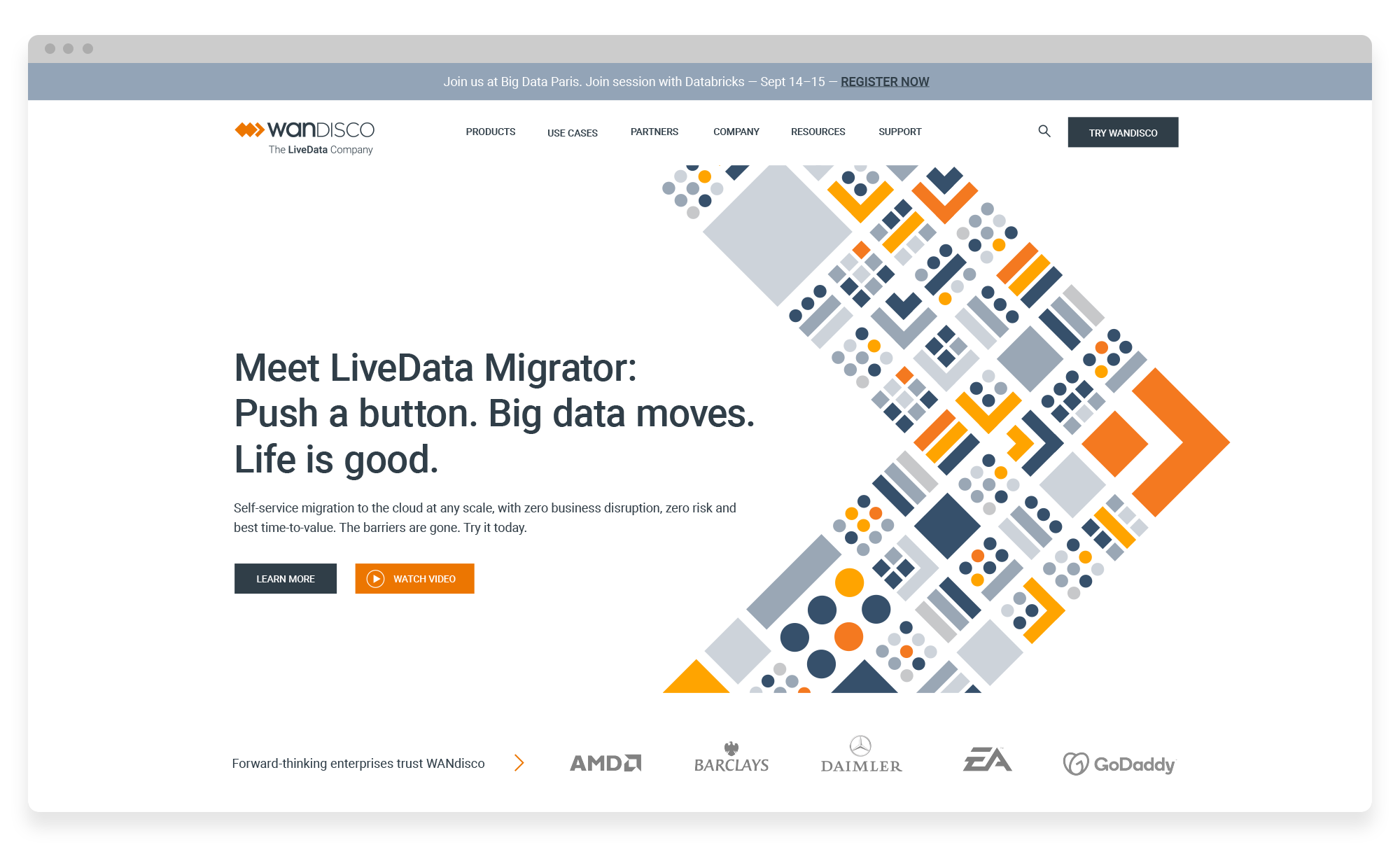
WANdisco corporate website was due for a transformation that would reflect the maturity of our products and readiness to take off. Our Creative Team led the way in creating a captivating marketing campaign for our groundbreaking product, LiveData Migrator. Its success depended on reviving our website, which had become outdated, no longer in tune with our brand's identity. We aimed to transform it from a dull and dreary place into a vibrant manifestation of our innovative cloud computing enterprise. To add to the excitement, we challenged ourselves to launch the new website within a tight and compressed timeline.
The Approach
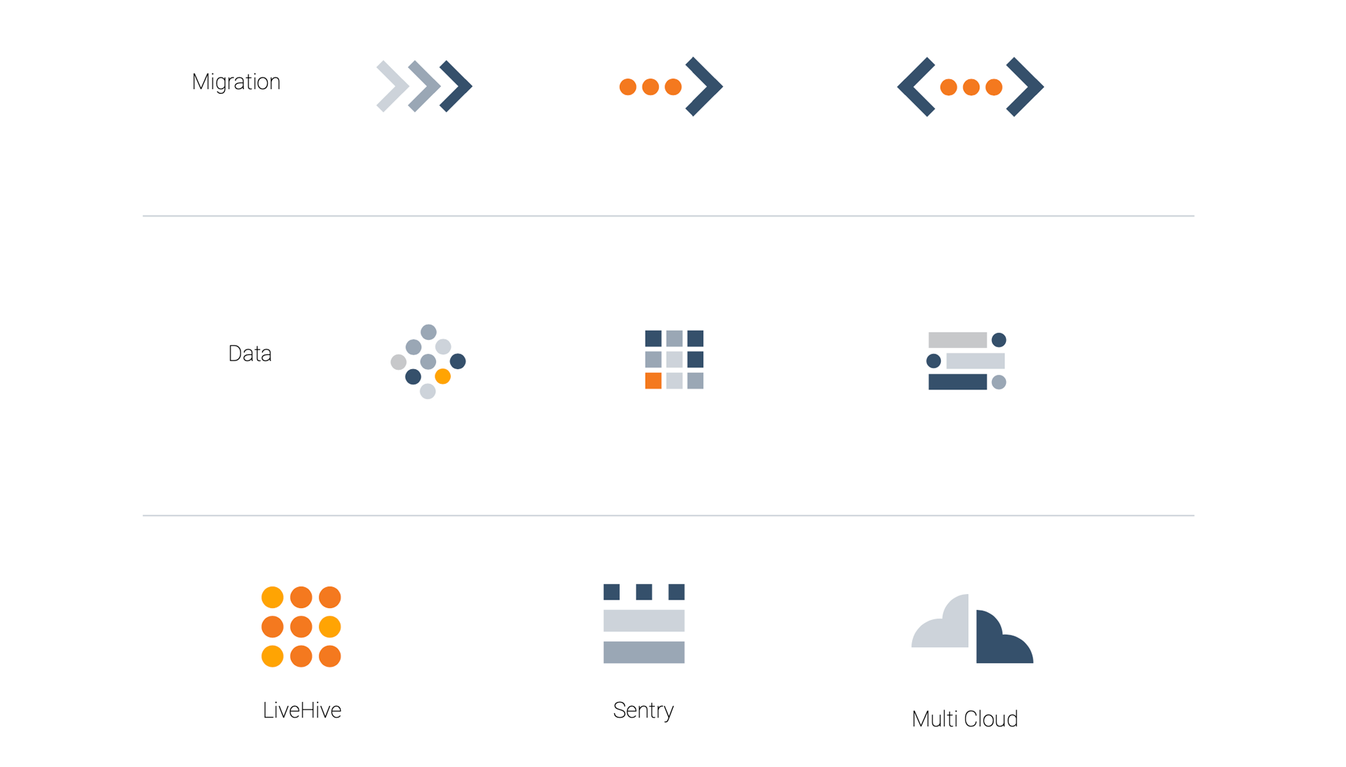
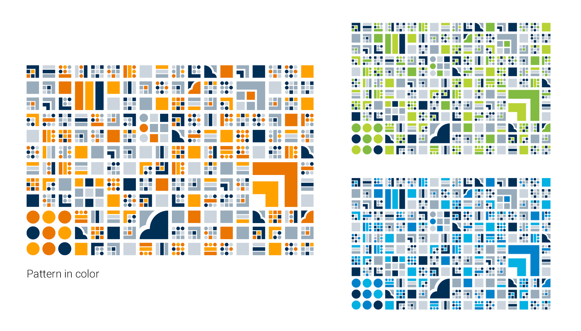
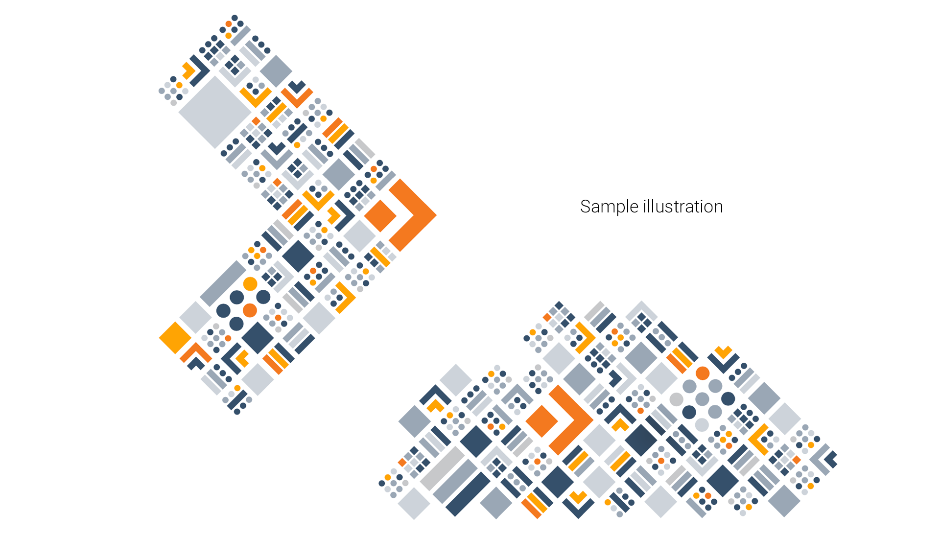
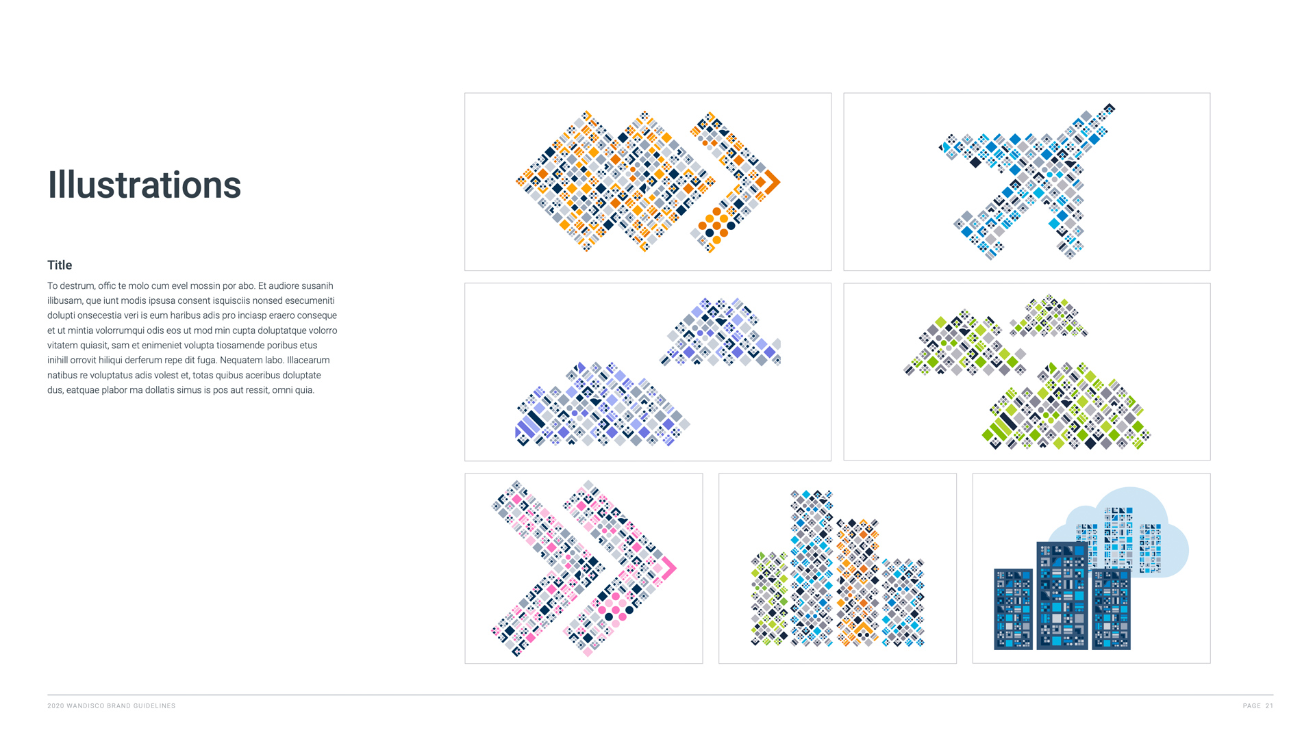
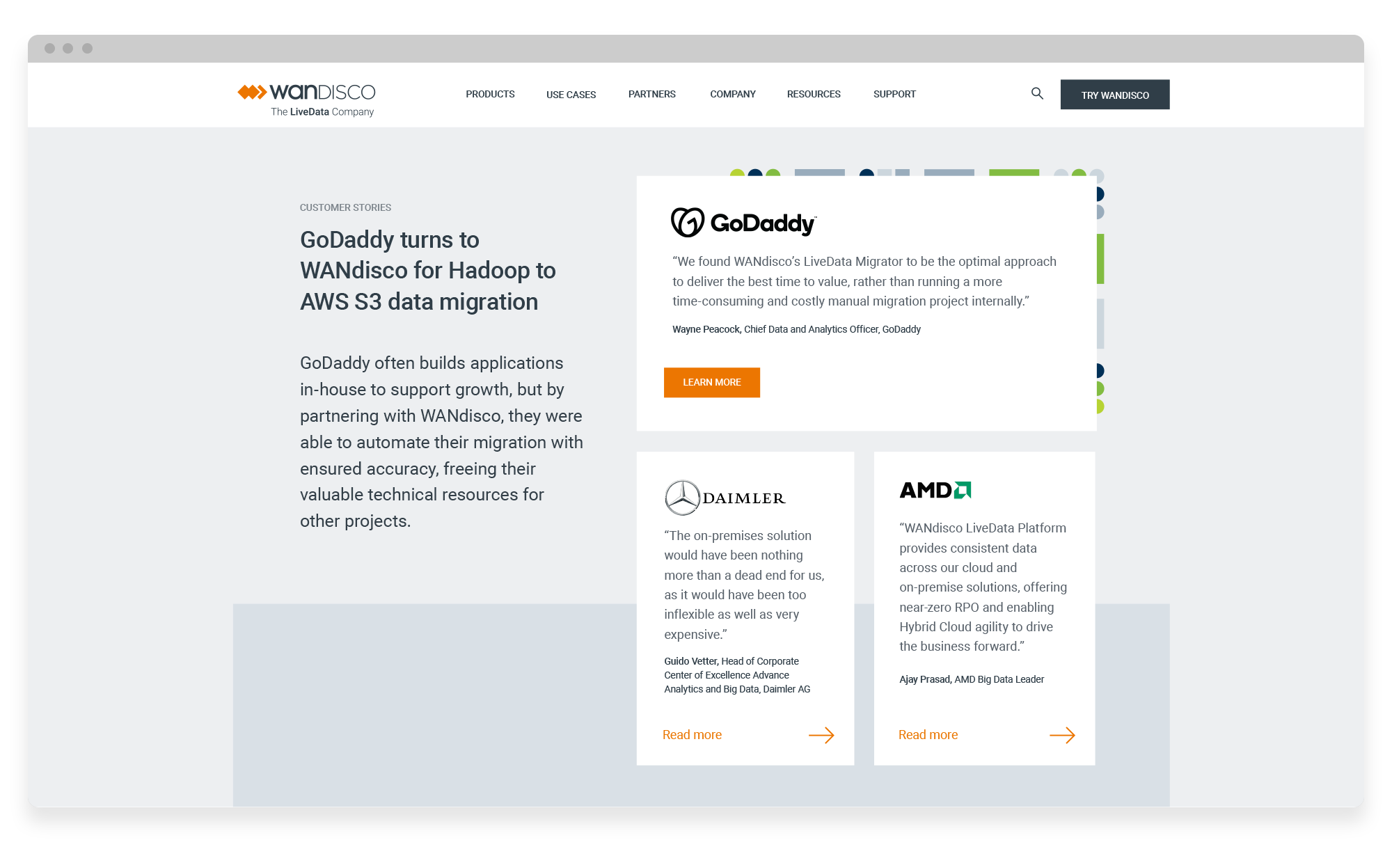
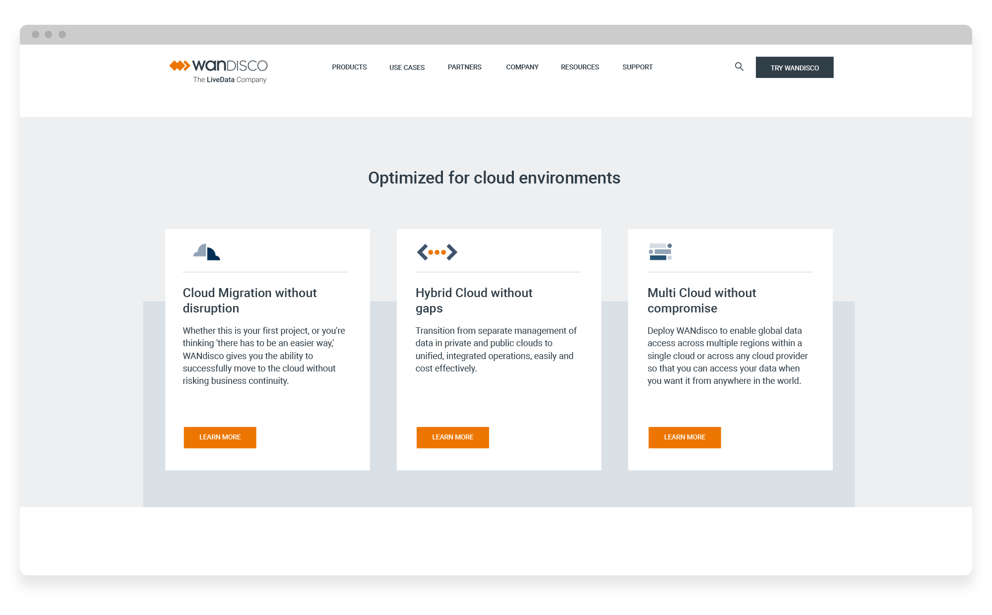
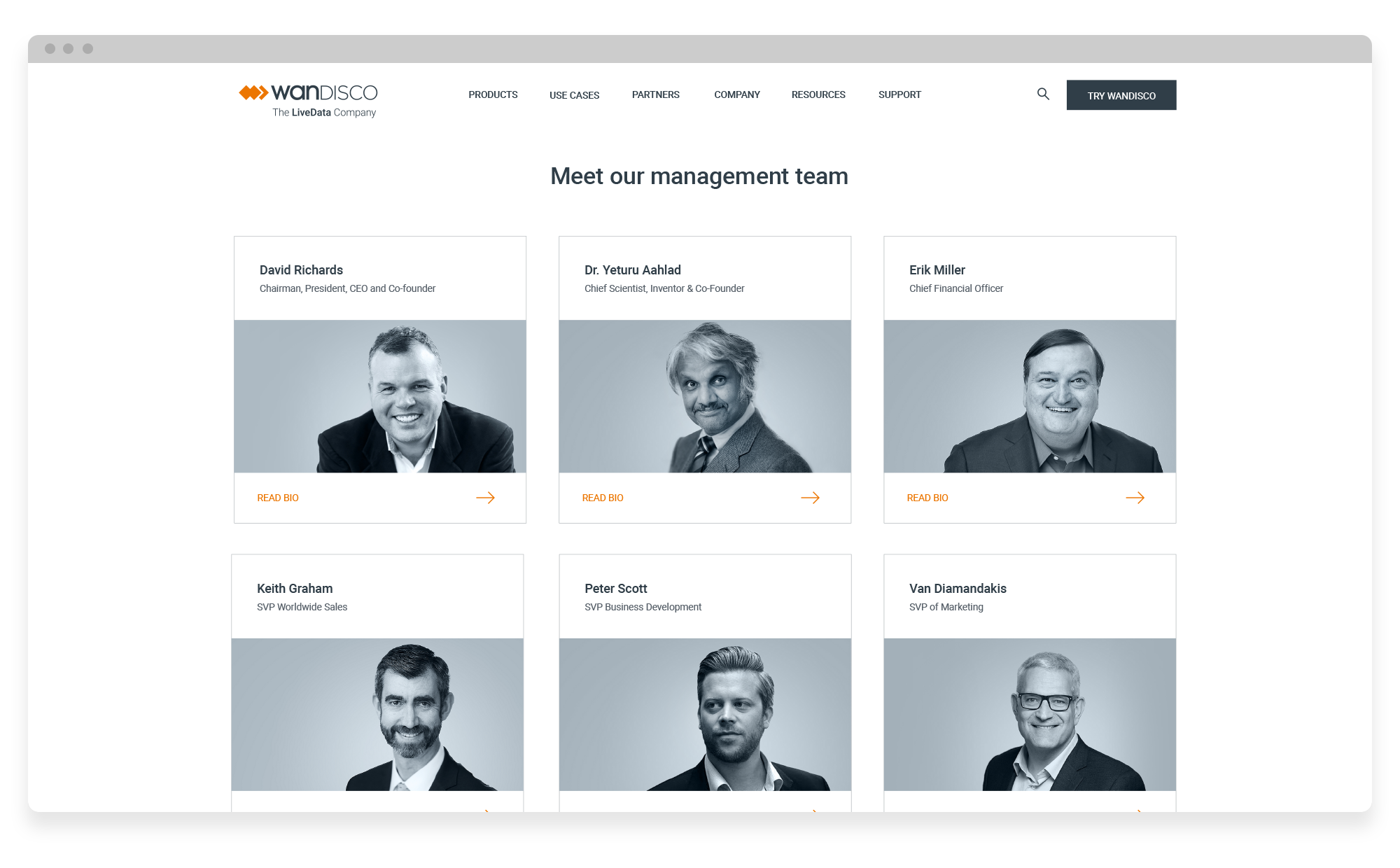
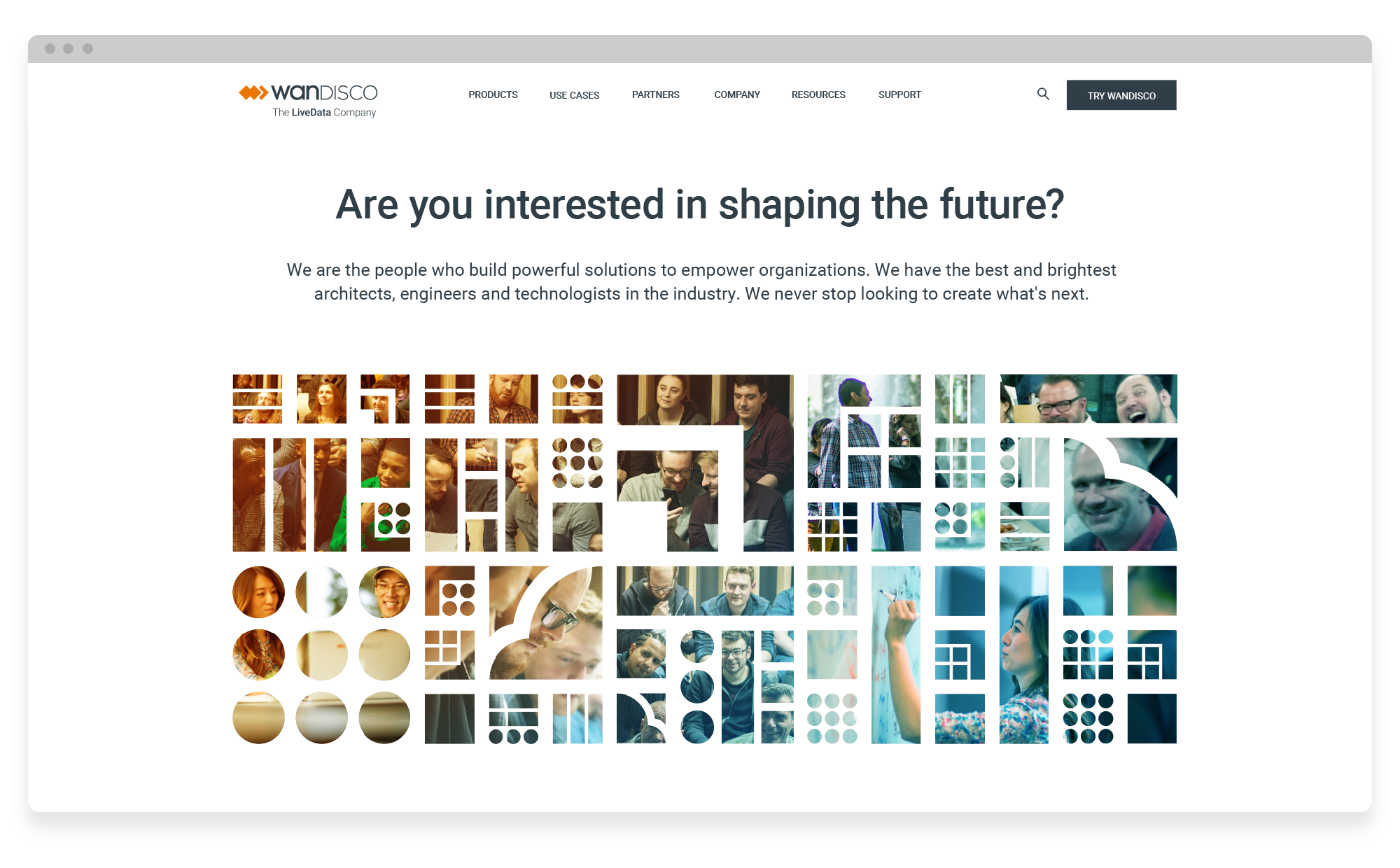
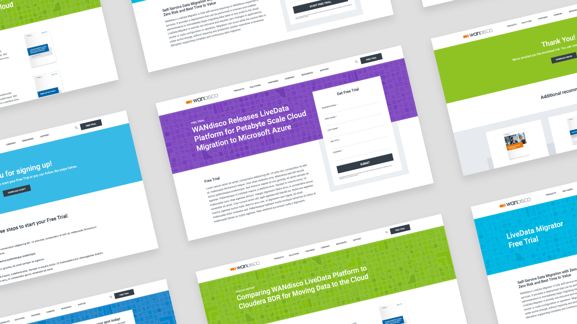
We collaborated with an external agency to come up with a new visual concept that tells the WANdisco brand story. We aimed to represent data in a way that doesn't rely on common cliches such as pictures of clouds, server rooms, and happy people on computers. Our goal was to create a visual design language that conveys authority, seriousness, modernity, credibility, and the scientific/engineering aspects of our work. As a result, we developed a concept presented in a pictorial form using geometric shapes and icons. The design elements were based on the WANdisco logo mark, the orange diamond shape, which we extended to a variety of squared shapes. This design is extensible to the entire site.

Before and After
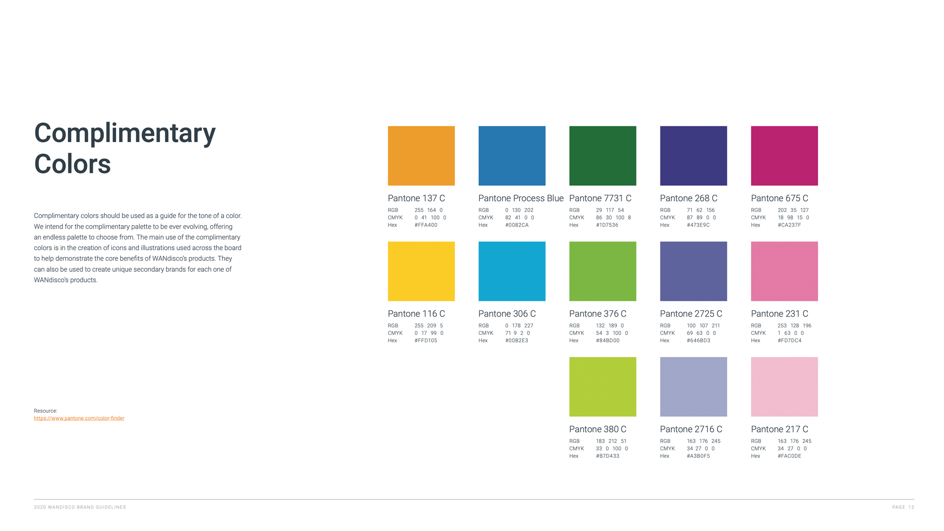
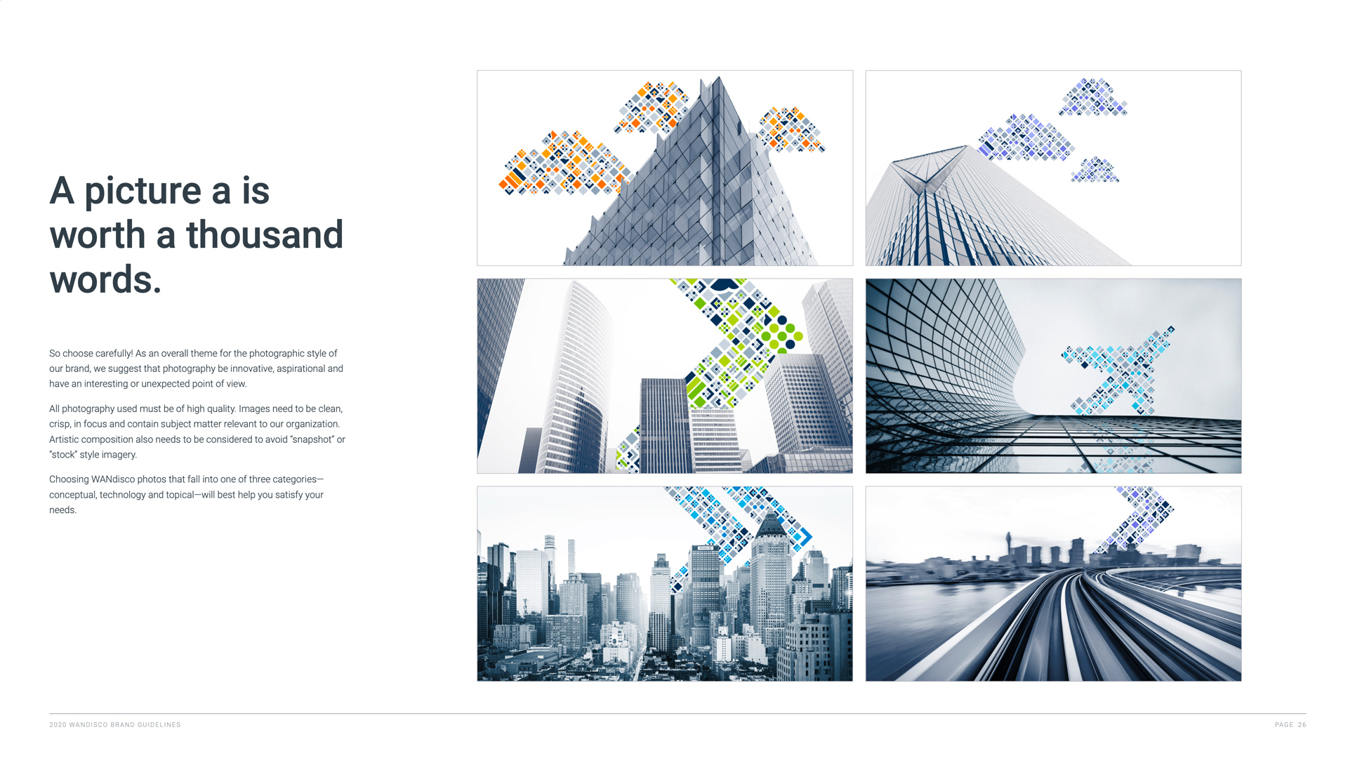
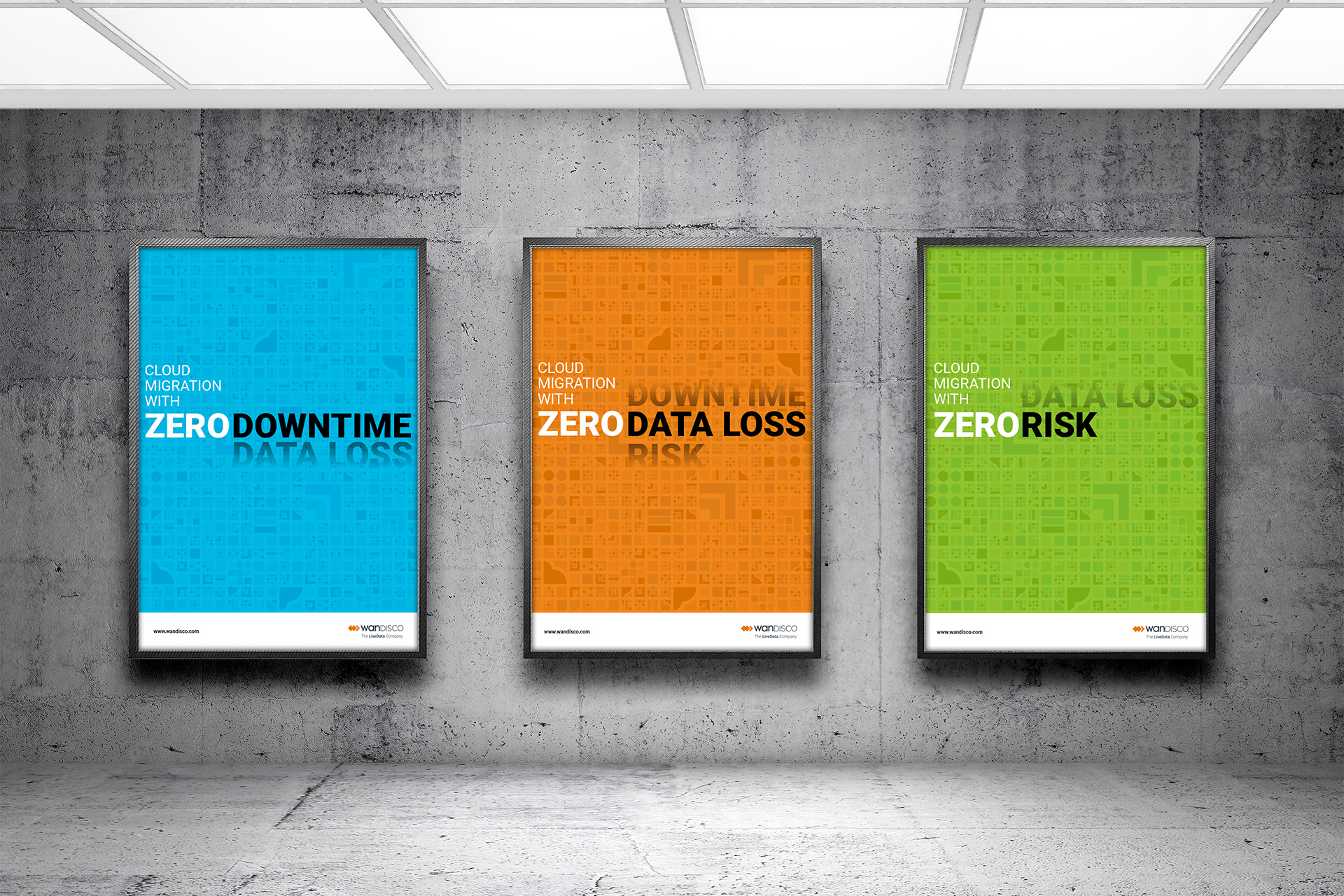
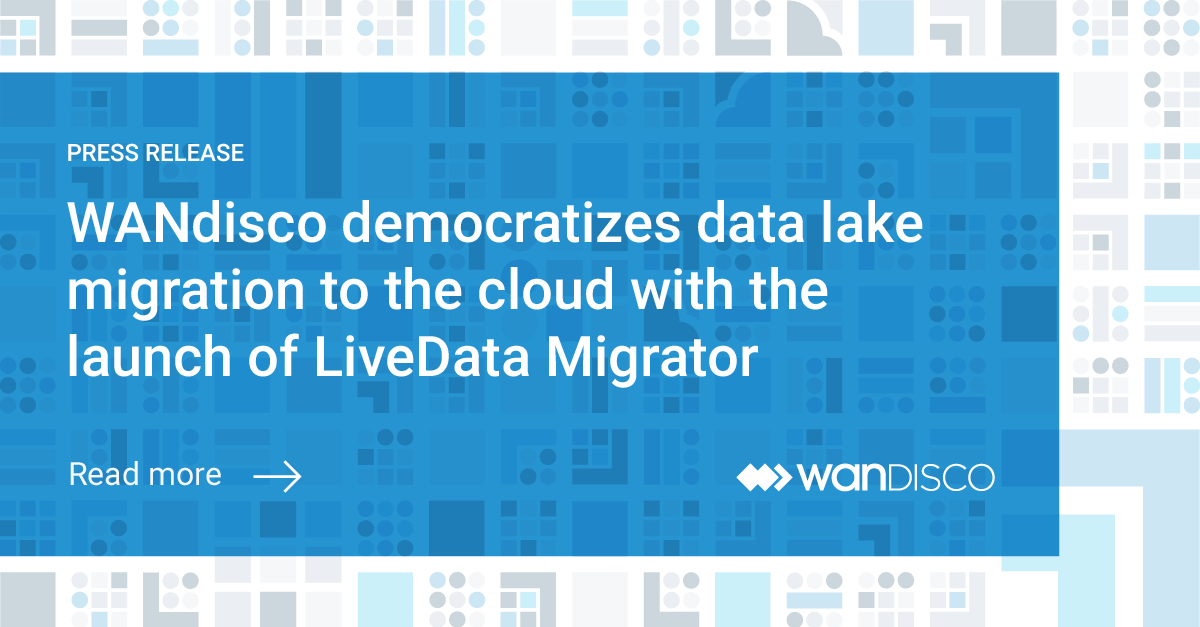
The brand elements were extended to a variety of mediums to show the new design flexibility and creativity beyond stock photography. When using photography can be combined with iconography shapes and patterns. The color palette was expanded to give more dynamic and freshness to the overall look and feel. This brand refresh brought transformation to WANdisco's brand.
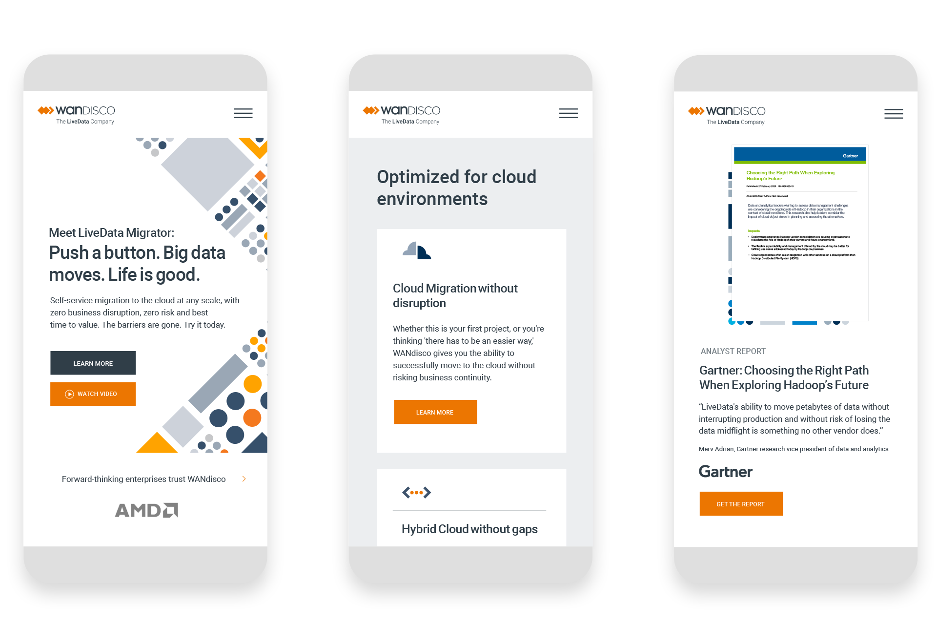
Landing Pages
OOH

Social Posts


“When it comes to delivering insightful creative solutions and driving successful team operations, Edwin has brilliantly led our brand refresh, inspiring the team to break the mold and organizing the tasks needed to deliver this awesome assignment in a compressed schedule.”
Alex Grossman, a former Head of Marketing Services and Brand at WANdisco


“From a brand refresh on our partner pages, to the creative on a new partner program, to joint marketing with partners, Edwin’s work has always been refreshing. He is very thoughtful in his approach.”
Shelly Koglin, Channel Marketing Director at Ping Identity
Let’s work together.
Previous
Next
